Giving my sidebars a CSS Facelift

Continuously Evolving Style
Part of the reason why I like hand coding my website is that my freedom to express myself with code is limited entirely to my knowledge. With that level of freedom, Facebook and literally every other social media platform in existence today is just dull and boring. Of course, that means I have to put a lot more time into the design of my website than I would any social media platform, but you can't have a labor of love without labor!
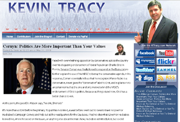
When I re-launched KTracy.com as an HTML5 throwback to the early days of web design, I wanted to pay homage to the original KTracy.com design (a design concept lifted from the early days of the Bush White House). That meant putting in a solid blue header bar and left sidebar. However, as I've looked at the sidebar and header for the last two and a half years, I realized that this throwback design feature I first used in 2001 when I ran for Class Representative when I was a Junior in High School really didn't represent the heights of KTracy.com web design. I felt like that happened around 2008 when WordPress was still somewhat lightweight and flexible enough that a novice like me with a little experience with PHP, CSS, and a lot of HTML could make a really incredible theme. Below is what that web design looked like:
I still have that theme's files saved my archives, but I can't be bothered to install WordPress to take a better screenshot. However, I did have a design file archived showing a proof of concept in a slightly higher resolution. The graphics were different, but you get the idea.
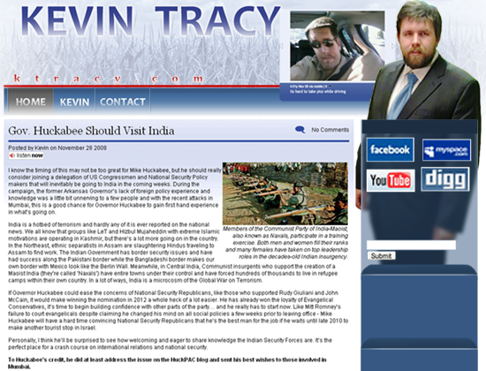
Aside from some goofy pictures of myself used in this web-design, I felt like this was peak KTracy.com web design. Thanks to some clever CSS work with the position and z-index properties, I was able to make my WordPress installation look totally unique in an ever growing interweb where everyone was starting a blog.
When I stepped away from politics for a long break in 2010, I reflected on how I lost my passion for America's first blood sport. I came to the conclusion that I needed to start from scratch and go back to my roots, including designing the website from scratch without an increasingly clunky WordPress installation to crash Bluehost every day I had moderate traffic. In 2012, I launched a short-lived first attempt at what I accomplished in 2021: a KTracy.com rebirth celebrating the Web 1.0 era we started in:
There were a few problems with this approach at this time, however.
- I wasn't totally ready to give up on comments yet.
- Transferring the WordPress archives was going to be a massive undertaking that I didn't have the time for in 2012
- My fiancée at the time told me she wanted to write, but the coding was too intimidating (after I re-installed WordPress, she still didn't write anything)
- I was working two full time jobs between my day job and finishing The MSPaint Comic: Volume 1.
I ultimately feel like I gave the 2008 design a nice facelift in some areas, but in others, I feel like this design fell flat and lacked the charm the 2008 site had.
When I decided to try the Web 1.0 thing again in 2021 to kill time while dealing with a stressful divorce, I considered relaunching this 2013 version of the website, but I had some really cool ideas about using multiple PHP includes within other PHP includes to create a super customizable theme that could grow with me as a web designer.
Normally, the changes I made today with the sidebar would have probably justified a new theme with a new codename. However, thanks to my excessive use of PHP includes, the 2021 core is still in tact and should be for many more years.
The Overlapping Kevin Tracy
Obviously the big similarity between the 2008 and 2013 designs with this current design is the presence of my image over a right sidebar and overlapping the header of the web design. I'll be honest, this idea was inspired by Mitt Romney. In 2008, I was in Iowa supporting Mike Huckabee in the Iowa Caucuses. My friend Anthony Bonna and I were in headquarters doing opposition research on Mitt Romney, and the guy had this REALLY ingenious video of himself with a transparent background walking across the bottom of the screen and explaining why people should caucus for him in a night or two. It was REALLY cool, but everyone (myself included) really despised Mitt Romney, so I had to act like it was some opulent thing that he had wasted a ton of money on just to show off. This kind of thing isn't uncommon today, but in 2008, it was absolutely incredible. When I began designing the new KTracy.com theme in late 2008, I knew that I wanted to ignore the boundaries of normal web design; which was still largely done with tables instead of div tags with significant CSS behind them. That didn't start until more and more people began surfing the internet on their phones and responsive web design became more important. That 2013 design actually was made in part with tables and was completely non-responsive. That's part of the reason why I didn't use it.
Funny thing: in 2007, I got an LG Chocolate phone. Although I didn't buy a data plan for it, Verizon allowed me to test drive one with internet access in the store. The first thing I tried was going to KTracy.com. At the time, my WordPress theme (Lostsol) had two sidebars on either side of the content, similar to the two sidebars on KTracy.com today. However, before you could look at my blog, you had to scroll all the way down the left sidebar; which was really difficult and time consuming on that phone. When I redesigned KTracy.com's WordPress theme in 2008, I intentionally used a RIGHT sidebar only; which was very untraditional at the time, but it ensured that the sidebar would come after the blog content if loaded on a small screen. It wasn't technically responsive by modern standards, but it lasted long enough for WordPress to create responsive themes that completely broke my ability to design my own themes. When I designed THIS theme, it was important to me that it be responsive; which was exceptionally time consuming to figure out, but eventually I did and now I can have two sidebars again to make use of the widescreens everyone has on their desktops.
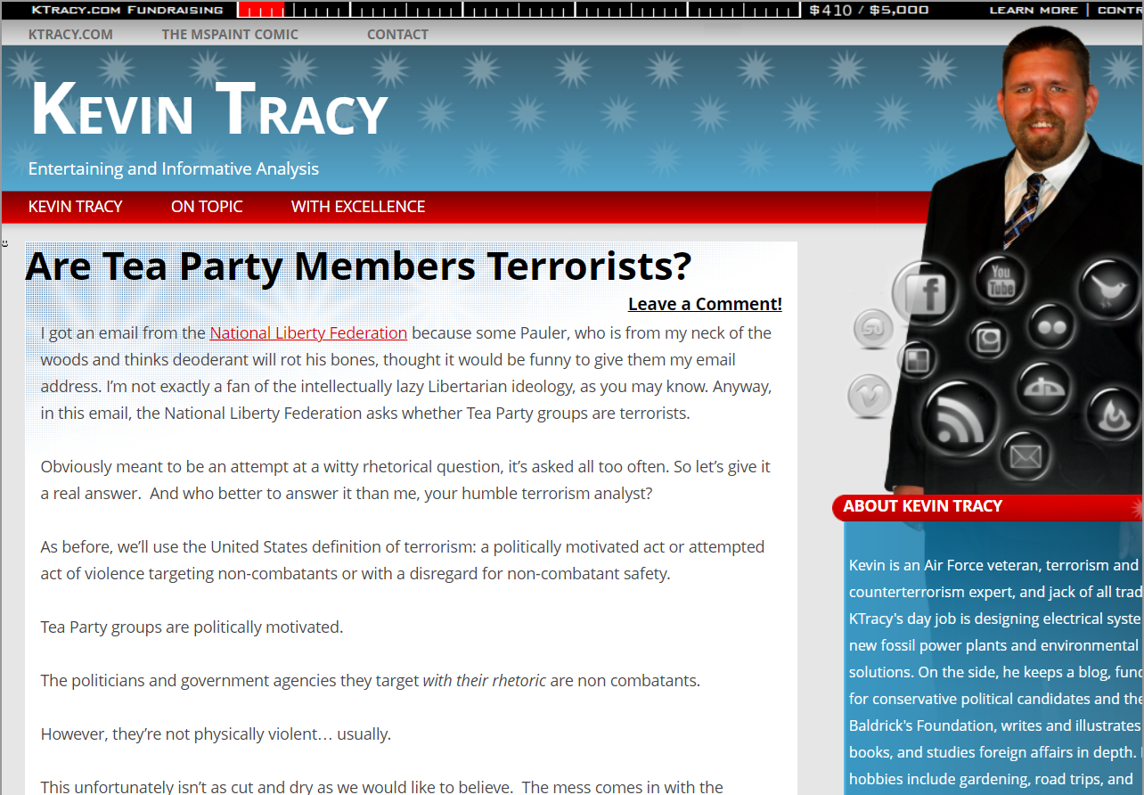
Back to the topic at hand! Although I still comment on politics here and there, I'm primarily a pixel artist now and I want this website to showcase my skills. So, I spent several hours creating a high resolution pixel art self portrait in Paint.NET while streaming on my Twitch channel; which will eventually be a YouTube video. I actually spent more time drawing the self portrait than I did the coding to implement it on the website. Eventually, I want to animate this portrait in a cool way, and when that happens, I'll feel like I've truly reached Mitt Romney's multi-million dollar web design (of 2008).

With this guy done, it was time to work on updating the CSS for the right sidebar.
My ultimate solution was this for wider screens with two sidebars next to the content:
right-sidebar {
	position: relative;
	top: -180px;
	z-index: 999;
}
The first two properties moved my entire right sidebar up 180 pixels from its normal position relative to everything else in the theme; which would start just below the header. I then used z-index to make sure the sidebar appeared above everything in the header.
However, due to the height of my portrait, I needed the boxes of the right sidebar to overlap my picture. To accomplish this, I used the following CSS:
right-container {
	position: relative;
	top: -300px;
	background-image: linear-gradient(var(--headerbkcolor), var(--listbkcolorfade1));
    color: white;
}
Okay, there's a lot more going on here, but the above are just the changes made.
Same as the parent right-sidebar DIV, each box on the right sidebar (with a 'right-container' class) is now being told to render 300 pixels above its relative position. This causes them to overlap the self portrait I added to the top of the sidebar.
The backgrounds in these container boxes used to be white with black text. Now, they have a gradient. You'll notice that instead of colors, I'm using variables for this. Although I haven't done it yet, I want to be able to change the color of my website on a whim. Eventually, for St. Patrick's Day or Notre Dame game days, I'd like to change the blue to a green color. Perhaps on Pentacost, I could use red and on Good Friday, I would switch to Purple. You get the idea. By defining colors with variables throughout my CSS, I only have one HEX number to change for each color on my site instead of having to scroll through the entire CSS file to find each instance of blue being used.
Finally, because these colors are darker, I changed the font color to white.
When I rendered this, I thought it looked REALLY good... so good in fact that it made the left sidebar look like garbage.
While the right sidebar didn't require any HTML aside from a new IMG tag for the portrait, the left sidebar was made totally differently than the right sidebar. I simply made the HTML match the right side, defined a left-container class, and copied all the right container properties over to the left container properties.
What's Next?
While I was messing with the CSS, I also tested a dark theme for my website since I don't like the stark white. However, I didn't care for the way it looks. So that may not come for a while.
Instead, it's going to be full speed ahead on creating a page template for the Webcomic.