Drawing Semp's Retirement Poster
How It Was Made
In the video, I explain the motivation for my art and talk about what I was thinking about during its creation. On this page, we will discuss how it was made, including the techniques and styles.
Step 1: 5-Point Perspective
This is actually my third attempt at drawing a major pixel art piece in 5-point perspective. The first being a still unfinished tribute to Gloryhammer's song The Unicorn Invasion of Dundee. The second being the background of a nearly finished fan art piece of Claire from the Claymore anime and manga. I really need to finish that one.
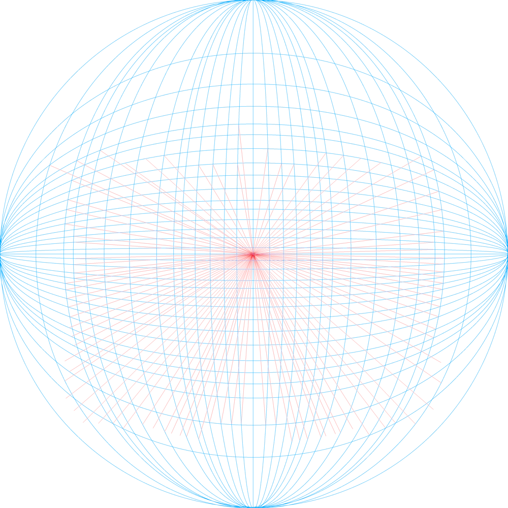
As explained in the video, 5-point perspective can be used to create a fisheye lens effect in your art. However, I have found that if you use a gigantic 5-point perspective grid that far exceeds the edges of your art piece, the resulting effect is something similar to panoramic human vision.
The 5-Point Perspective grid is essentially the front half of a sphere. You can create it by drawing a circle, drawing a line from the left to the right through the center (your horizon), and a vertical line through the center (the intersection is your vanishing point). Then create curved lines to create the illusion of the sphere, bending more towards the outside and less towards the inside of the circle. Here's the 5-point perspective grid I use for all of my digital art now (I'll even crop this, and print it out, and trace the grid for my analog art.

I'm still new enough at 5-point perspective that I can't draw without the grid yet, but I hope with practice and time, I'll develop that ability.
Sketch to Line Art
With my 5 point perspective grid in place, I used Clip Studio Paint and my XP-Pen drawing tablet, to do a rough sketch of my art piece. Creating rough sketches in MS Paint is actually the worst and most time consuming part of being an MS Paint artist. When I would do this in MS Paint, I would create the roughest rough sketch in one color, then a not-so-rough sketch in another color, and if necessary do a third rough sketch that I would cut up and move around to make perfect, usually in blue. Finally, I would do my line art in black.
Now, with the drawing tablet, all of those rough strokes are done in Clip Studio Paint on different layers. I can turn off all of the layers I don't want and export that to an image file I can open in MS Paint; where I draw my line art directly over the sketch. Since that line art is all black. It happens so fast in this video that it barely shows on screen, but I'll export the image to another program where I can then erase everything EXCEPT black.
That leaves me with just the line art and none of the sketch.
Shadow Map
After drawing my Tom Waits piece, I realized it would be beneficial to find a way to map where certain color lights hit a subject and overlap those in a program like GIMP to create more realistic lighting more easily. Color selection in particular is extremely difficult when you have to consider the base color of the subject, the ambient light, and one or two overlapping colors. Unfortunately, I was never wildly in love with the effects I was getting from the light mapping as I was doing it for the Claymore piece. However, I realized the idea could work pretty incredibly for mapping shadows instead of light.
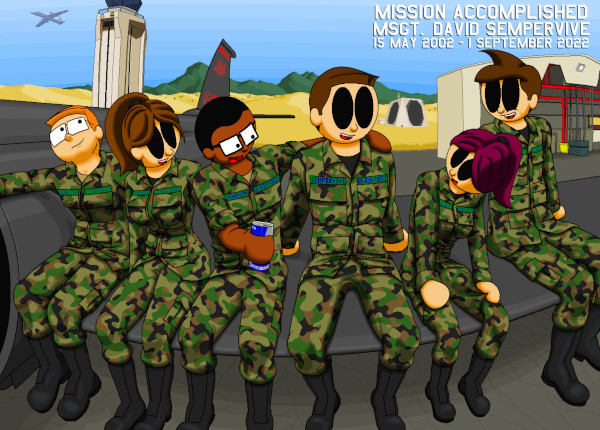
When drawing The MSPaint Comic, just about everything got one-color shading, unless it was reflective; in which case it might get three or four colors. There was one exception to this: camouflage.
Now, because this was a poster, I wanted the shading to look INCREDIBLE. I knew from coloring page 9 of my coloring book in MS Paint that multi-color shading looks remarkable on my characters. However, because of the complicated nature of the camouflage pattern, shading it in MSPaint was too time consuming do for the comic book. However, I realized while experimenting with the Claymore piece that I could create a "Shadow Map" of where shadows from different light sources would overlap! The best part about this approach was that the shadow map could overlap the four colors of the camouflage and continue smooth curves naturally without me having to adjust them pixel by pixel every time a color changes. In the future, I might actually do this on the MSPaint Comic.
So, when you see me drawing in the uniforms with multiple shades of gray in the above video, that's the shadow map I'm talking about.
Framing
I made one ENORMOUS mistake with this art piece. When I got started, I think I assumed I was drawing a 16x20 (a 4:5 ratio) print. However, the printer Beth was using kind of boxed us into a wider 2:3 ratio. This didn't really impact the foreground at all, but it pretty much meant I had to re-sketch out the background to ensure the traffic control tower could fit neatly in the piece.
Unfortunately, it lost some of that 5 point perspective curviness in the process. I actually feel like the piece lost a little bit of the magic when I had to redraw the tower, but that was my own fault for not knowing the dimensions of the final print before I started.
As I said in the video, I procrastinated getting started on this and should have found this out much sooner, but I was flying by the seat of my pants.
Details Excluded
I actually planned to show cracks in the asphalt below the U-2's wing, and drew them in. In every art piece, you have to make considerations for what details you show and don't show. I actually showed asphalt cracks in The MSPaint Comic, and even though only one person ever noticed it and said anything about it to me (I love you, Flavio!), I think it adds a little charm to the art.
However, in this art piece, even if I made the cracks more faint, I felt like they just didn't belong in the art piece and they were actively taking away from the characters in the foreground. You see me drawing these and trying to make them work towards the end of the video, but they don't make the final cut.
Roasting Semp
So, I knew Semp wanted a roast for his retirement party. Unfortunately, I was so busy with this piece that I feel like I failed to properly prepare for the roast.
This was also Katie's first time filming me. Katie is a huge fan of short format videos and her phone has laughably little memory, so she keeps her videos extremely short and she was slow to start recording and quick to stop. I should have explained to her the importance of filming before and after the content so there would be room to edit. So don't blame the camerawoman, this was my fault for not telling her what to do.
While this was far from what I hold as my standard for public speaking, and while I really screwed up that "uglier than the withdrawal from Afghanistan" joke (which is why I used it in the video), I thought the content was still worth sharing. Semp, Beth, and I have been through a lot in the last 20 years. However, the one constant has been our friendship. Like I said in the video, this brotherhood is real and the bonds do not fade, even as the memories of what we did together does.
I was so happy to be in a position to travel south with Katie to see these guys again. It was also really nice being around Air Force intelligence men and women again. Honestly, there's a comfort in that population that I didn't realize how much I missed until I was surrounded by them.
For what it's worth, Semp loved the roast and he and Beth both came up here for our Wedding of the Century the next year in 2023.
I really love these guys I served with, and I am beyond happy to have had the opportunity to create this piece celebrating our unbreakable bond.


